Find Your Way Around the Office: How to Use Signage and Wayfinding Effectively

Find Your Way Around the Office: How to Use Signage and Wayfinding Effectively
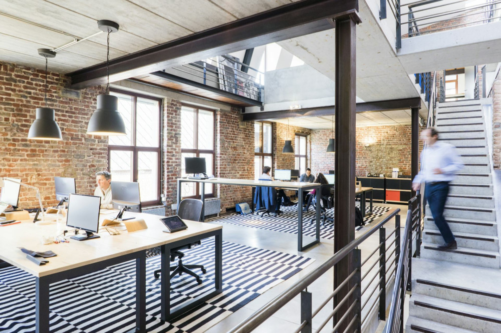
An office where employees and visitors can easily find their way around feels calm, efficient, and professional. Yet wayfinding—the art of helping people orient themselves—is often an afterthought, only addressed once confusion has already set in. With thoughtful signage and a clear visual system, you can make everyday navigation easier for everyone who moves through your workspace. Here’s how to use signage and wayfinding effectively in a Canadian office context.
Why Wayfinding Matters More Than You Think
When someone walks into your office, they form an impression within seconds. Is the reception easy to spot? Are meeting rooms clearly marked? Can visitors find the washroom or kitchen without asking for help? If the answer is yes, your space feels organized and welcoming. If not, it can create frustration and wasted time.
Good wayfinding isn’t just about aesthetics—it’s about psychology and function. It helps the brain create order and reduces stress, especially for guests, new hires, and partners who aren’t yet familiar with the space.
Start by Mapping the Movement
Before you put up any signs, take time to understand how people actually move through your office. Walk the routes yourself—from the entrance to reception, from work areas to meeting rooms, from the printer to the lunchroom. Notice where your eyes naturally go and where you hesitate.
Then, sketch a simple plan of the main routes and intersections. These are the key points where signage will be most helpful. Think about how a new employee or visitor experiences the space for the first time—they’ll need more guidance than those who already know the layout.
Signs That Speak Clearly
A good sign is easy to read—both visually and linguistically. Use short, clear words and a simple design. Avoid internal abbreviations or creative names that only insiders understand. A meeting room called “Meeting Room 1” is often more practical than “The Innovation Den” if it helps people find it faster.
- Typography: Choose a font that’s easy to read from a distance. Sans serif fonts often work best.
- Colours: Use strong contrast so text stands out clearly.
- Icons: Simple pictograms can support text and help in multilingual environments.
- Placement: Signs should be at eye level and positioned logically—before a turn, at doors, and at intersections.
Build a Visual System
Wayfinding works best when there’s consistency in design. Use cohesive colours, materials, and typography so the signage feels like part of your company’s identity. For example, each floor or department could have its own colour, helping people instantly understand where they are.
A visual system can also include floor markings, wall colours, or lighting that intuitively guide people. The goal is to create a sense of flow so that navigation feels natural rather than forced.
Læs også:
Embrace Digital and Flexible Solutions
Modern offices change frequently—meeting rooms get renamed, departments move, and new zones appear. Digital signage can be a smart solution. It can be updated quickly and display real-time information such as meeting schedules, names, or announcements.
Interactive wayfinding screens in the lobby or near elevators can also provide an overview of the office and direct visitors to specific people or rooms. This adds a dynamic and professional touch to the experience.
Think About the Whole Experience
Wayfinding isn’t just about direction—it’s about how people feel in your space. A friendly “Welcome” at the entrance, a clear floor map, and small touches like icons near the coffee station can make a big difference.
Consider how your signage reflects your company culture. A creative agency might use playful design and bold colours, while a law firm may prefer a more understated, elegant look. The key is that it feels authentic and supports the atmosphere you want to create.
Test and Adjust
Even the best system can be improved. Invite colleagues or visitors to test your wayfinding: Can they find the meeting room without help? Do they understand the signs? Where do they hesitate? Small adjustments in placement, colour, or wording can make a big impact.
Wayfinding isn’t a one-time project—it’s an ongoing process that should evolve with your office. When new spaces are added or functions change, update the signage so it always reflects reality.
An Investment in Well-Being and Efficiency
An office with effective wayfinding saves time, reduces confusion, and creates a more pleasant atmosphere. It’s an investment in both employee well-being and your organization’s image. When people can find their way easily, they feel comfortable and confident—and that positive energy carries through the entire workplace.
Læs også: